Trendy Tacos
A visually-rich, easy to use food ordering app for a taco truck, designed with Material Design 3 in mind.
-
The Product
The Trendy Tacos app is a visually-rich, easy to use food ordering app for a taco truck.
-
Project Timeline
This project took place from June - July 2023
-
The Problem
Trendy Tacos is so popular that it’s created frustrations for customers who have to wait in long lines. Ordering is inaccessible to people with vision impairments.
-
The Solution
Create a lightweight, easy to use, accessible food ordering app that allows users to order ahead of time, utilize screen reading technology, and fully customize their orders.
-
Role & Responsibilities
I was the UX Researcher and UX Designer and was responsible for all parts and stages of the design process.
-
Audience
People, especially business people, ages 18-80 in a busy metropolitan city
Design Process
Empathize
~
Define
~
Ideate
~
Prototype
~
Test
~
Empathize ~ Define ~ Ideate ~ Prototype ~ Test ~
Empathize & Define
User Research • Personas • Problem Statements • User Journey Maps
User Research Summary
I conducted interviews and created user journey maps to understand where in the ordering process things were falling apart, creating pain points for customers. I assumed that waiting in long lines were a waste of customer’s time, and that turned out to be right.
What I didn’t foresee was the menu being inaccessible to users with vision impairments. Because the menu is only posted on the taco truck itself, customers can’t read the menu until they get up to order. For customers with vision impairments, they need to have the menu read to them in order to order. This was not accessible.
User Pain Points
Long Lines
Customers had to wait in long lines to order. For many customers, this cut into their lunch at work hour so they had less time for their break.
Inaccessible
The menu is only visible once customers get to the order window. Users with vision impairments have to have the menu read to them.
Inefficient
Trendy Tacos can make food quickly, but taking orders one by one is tedious. The option to order ahead would increase efficiency and profits.
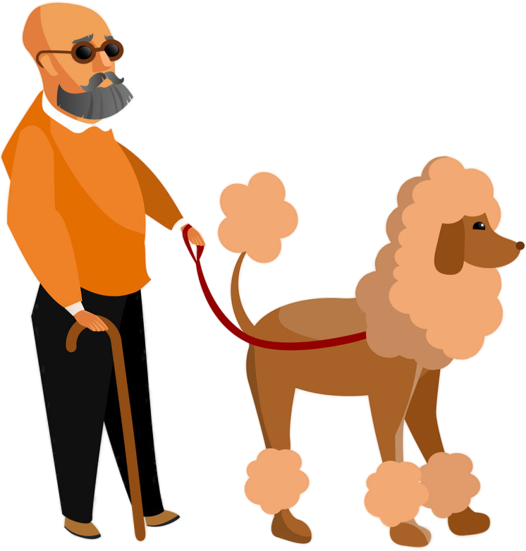
Persona: Devin
Devin, 57, Accountant
Husband, guide dog
Problem: Devin is a partially-sighted busy accountant who needs a more accessible way of ordering tacos from his favorite taco truck on his lunch break because he’s unable to read the menu.
Goals:
See big pictures of each menu item
More accessible menuAbility for the food ordering app to read what’s on the screen
Frustrations:
Can’t see menu, making it difficult to order
Doesn’t have time to wait in long lines, especially with my guide dog
Devin is a partially-sighted accountant who works in a Boston-area business park. He loves Trendy Tacos, but when ordering, it’s difficult for him to see the menus on the truck. This makes the ordering process stressful. He’d like an accessible, stress-free way to order tacos.
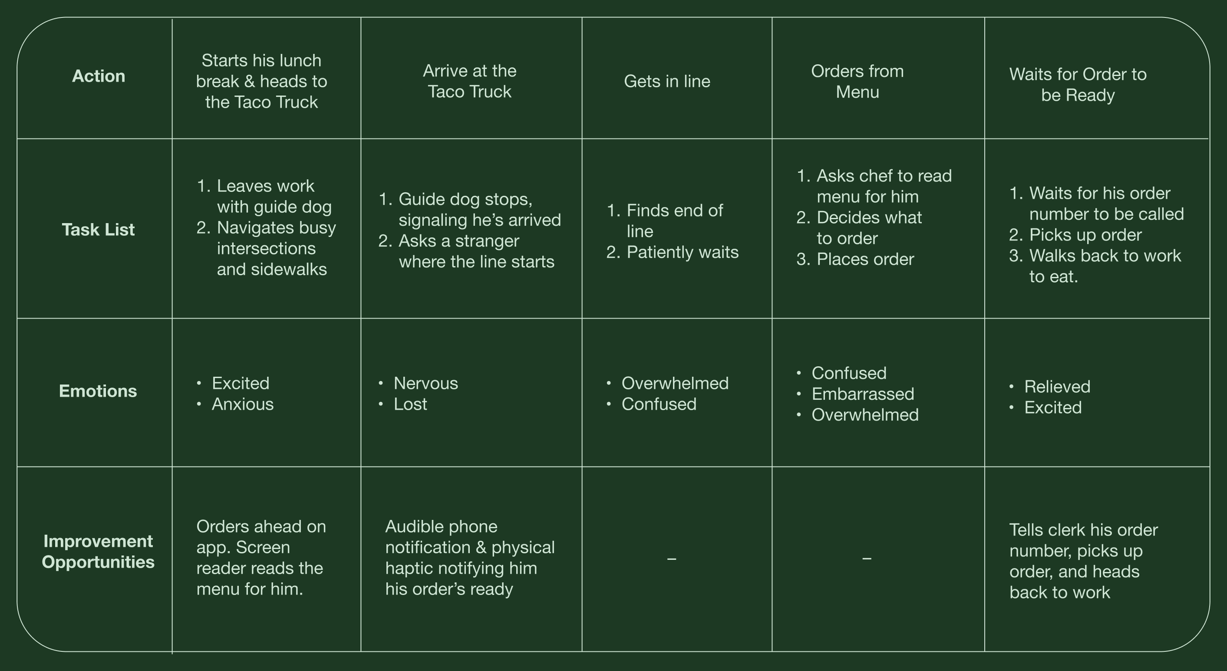
User Journey: Devin
Goal: Order tacos from a busy metropolitan Taco Truck on his lunch break.
User Journey Summary: Devin’s user journey map revealed a lot of areas the current way of ordering from Trendy Tacos was inaccessible. It helped shed light on how an app with screen reading technology, high contrast text, and big images would help benefit people like Devin who had vision impairments.
Ideate & Prototype
Paper wireframes • Digital wireframes • Low-fidelity prototype • Usability studies
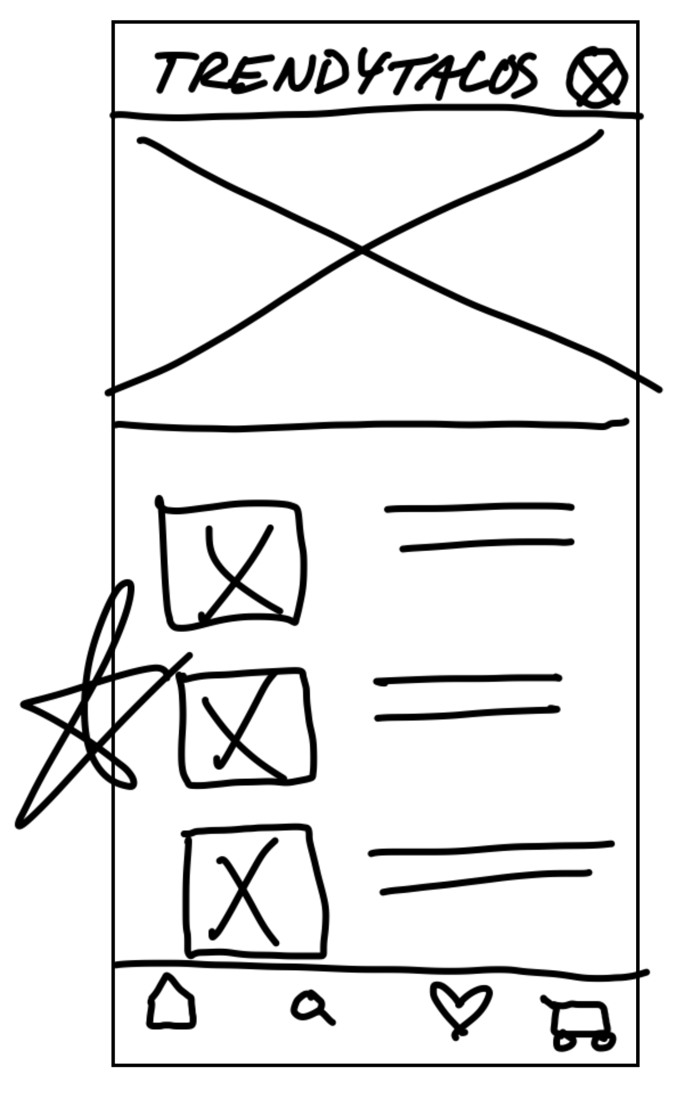
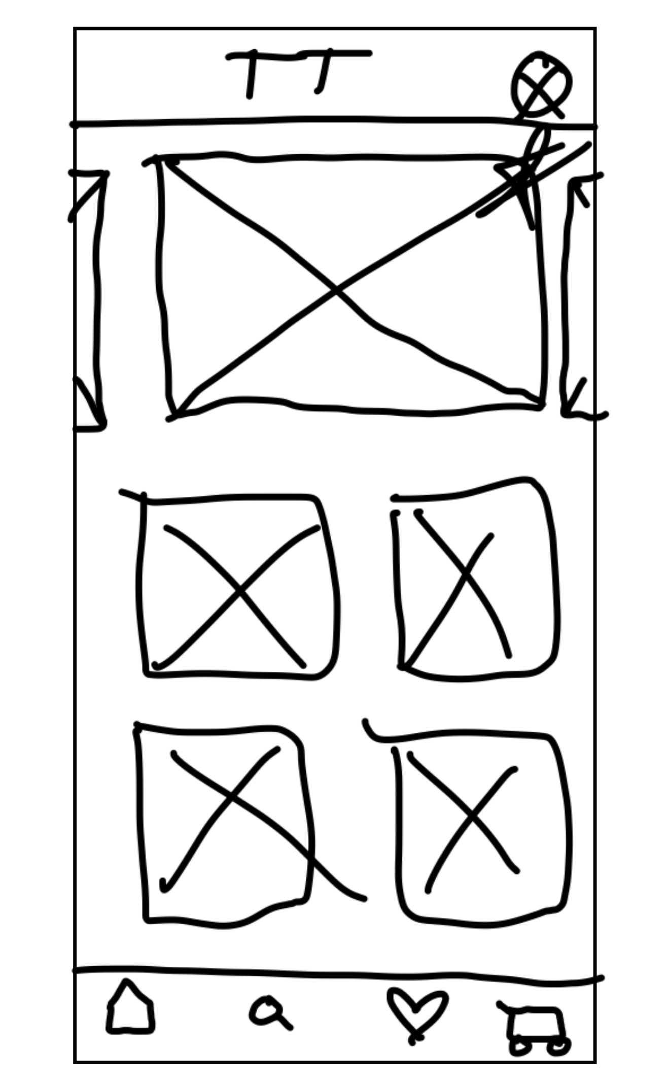
Paper Wireframes
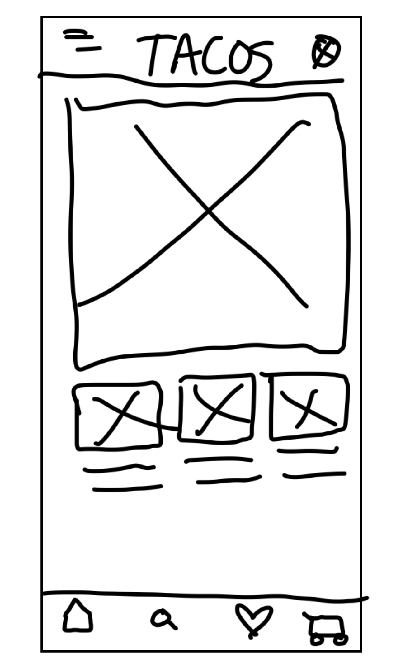
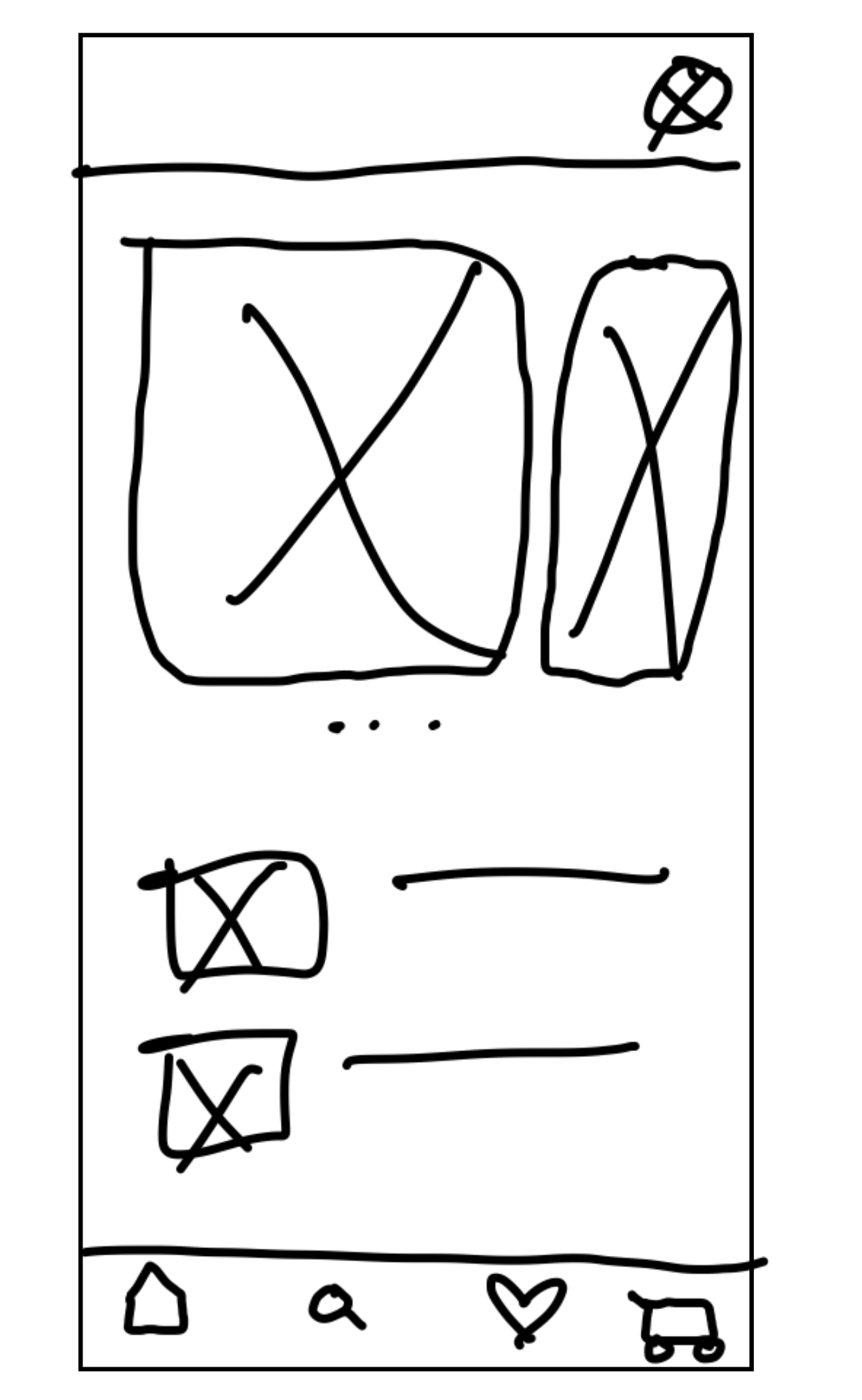
Sketching out paper wireframes was a great exercise in how the information architecture of the menu could be made more visual. Ordering what the user wanted in as few taps as possible was the goal.
Digital Wireframes
When researching, users noted that other food ordering apps tried to do too much, making the interface confusing to navigate. Using “cards” for each menu category helps the important things stand out.
Because Trendy Tacos prides themselves on being able to highly customize any order, having those customizations be clearly labeled in the check-out process was a must.
Including a QR code in the Order Confirmation allows customers to quickly pick up their order and allows the staff of Trendy Tacos to quickly get through orders.
Low-Fidelity Prototype
Usability Study Findings
I conducted a Moderated Usability Study of the Low-Fidelity Prototype, measured Conversion Rates, and had participants fill out a System Usability Scale.
Round 1 Findings
Most users felt like adding drinks was a tedious process
Most users liked the search button placement but would like Search in more places
Most users enjoyed the checkout process but some would like additional order confirmation.
Round 2 Findings
Users felt like the Home icon and terminology was disruptive to the order process, so it was switched to “Menu”
Users felt like some fonts were difficult to read, so it was suggested to increase size and contrast
Study ended with 100% Conversion Rate
Test
Mockups • Implementing Feedback • High-Fidelity Prototypes • Usability Testing
Mockups: Implementing Feedback
4 out of 5 users felt it was tedious to have to go all the way back to the home screen to add a drink to the user’s order.
3 out of 5 users thought the term “Home” was disruptive to the order process. This was replaced with “Menu.”
Several users noted that some text was hard to read, particularly with menu descriptions. To address this, font size and contrast were both increased.
High-Fidelity Prototype
After taking what I learned from the feedback from the mockups, I created high-fidelity prototypes.
Accessibility Considerations
Image Rich
Images are big, bright,
and used heavily to help visually impaired individuals.
Screen Reader
The Trendy Tacos app is screen reader compatible, to be accessible for people with visual impairments.
High Contrast
The Trendy Tacos app is screen reader compatible, to be accessible for people with visual impairments.
Going Forward
Takeaways • Next Steps • Thank You
Takeaways
Impact
The app makes users really happy they have more options to order from Trendy Tacos, and people with vision impairments love the inclusion of screen reading. “It’s such a relief that I can have my phone read the menu to me so I can easily navigate the app.” -Devin
What I Learned
I learned that users are really the ones guiding the UX Design process. It was a beautifully collaborative process, not only with other designers, but also with the customers of Trendy Tacos.
Next Steps
1
Complete another round of usability studies, focusing on the ordering process. Are there ways we can make this process even smoother for users?
2
Continue user research to make sure user’s needs are being met and that the original pain points have been addressed satisfactorily.
Thank You
Thank you so much for taking the time to look through this case study. I thoroughly enjoyed the creation process and learned so much through the customers of Trendy Tacos as well as the users who tested the app’s prototypes.

