Lifeline
A mobile app and responsive website that helps people currently without income find medical care near them.
-
The Product
The Product Lifeline is a mobile app and responsive website that helps people currently without income find medical care near them, giving them the lifeline they need.
-
Project Timeline
This project took place in August 2023.
-
The Problem
Medical care is inaccessible for many people. It can be hard to find quality medical care, especially for people currently without income that’s near them and accessible.
-
The Solution
Create an app and a simple yet powerful responsive website to help people find free medical care near them.
-
Role & Responsibilities
I was the UX Researcher and UX Designer and was responsible for all parts and stages of the design process.
-
Audience
Anyone currently without income who needs quality medical care.
Design Process
Empathize
~
Define
~
Ideate
~
Prototype
~
Test
~
Empathize ~ Define ~ Ideate ~ Prototype ~ Test ~
Empathize & Define
User Research • Empathy Maps • Personas • Problem Statements
User Research Summary
I conducted interviews, created empathy maps, and made user journey maps of people who have needed medical care in the last 6 months. Based off of the interviews, I found it was difficult for people with and without income to find proper medical care that fit their needs.
User Pain Points
Unavailable
For many people, especially those in remote or rural areas, healthcare isn’t available near them.
Inaccessible
Many healthcare apps and websites look nice, but don’t have accessibility built in.
Too Expensive
Even after users find quality medical care, it’s often far too expensive, even for minor things.
Empathy Map
Persona: Arjun
Arjun, 20, Farmer
High School Graduate
3 siblings, 2 parents
Goals:
Have more regular doctor’s appointments, despite no income
Monitor his diabetes long-term
Frustrations:
Doctors are expensive and medical care is hard to find
Making appointments is tedious
Problem: Arjun is a farmer with diabetes in rural India who needs a convenient smartphone app to make free doctors appointments because he needs to manage his diabetes long-term.
Arjun is a farmer with diabetes in rural India. He currently doesn’t have reliable income but he needs to have regular check-ins with a doctor so he can monitor his diabetes long-term. He needs an app to schedule a regular appointments with a free doctor as needed.
Persona: Saanvi
Saanvi, 52, Homemaker
Teaching Degree
Husband, 3 children, 5 grandchildren
Problem: Saanvi is a mother of 3 and grandmother of 7 who needs a responsive website to schedule as-needed doctors appointments for her grandchildren so she can keep them healthy and happy.
Goals:
Be able to book doctor’s appointments as needed
Keep her grandchildren healthy
Frustrations:
Doctors are expensive
Medical care is hard to find when she needs it
Saanvi watches her grandchildren during the day. She sometimes needs to take her grandchildren to the doctor. She does not have a smartphone, but has access to the library computers. She needs a website to book free doctors appointments for her grandchildren.
Ideate
Crazy 8’s • Paper wireframes
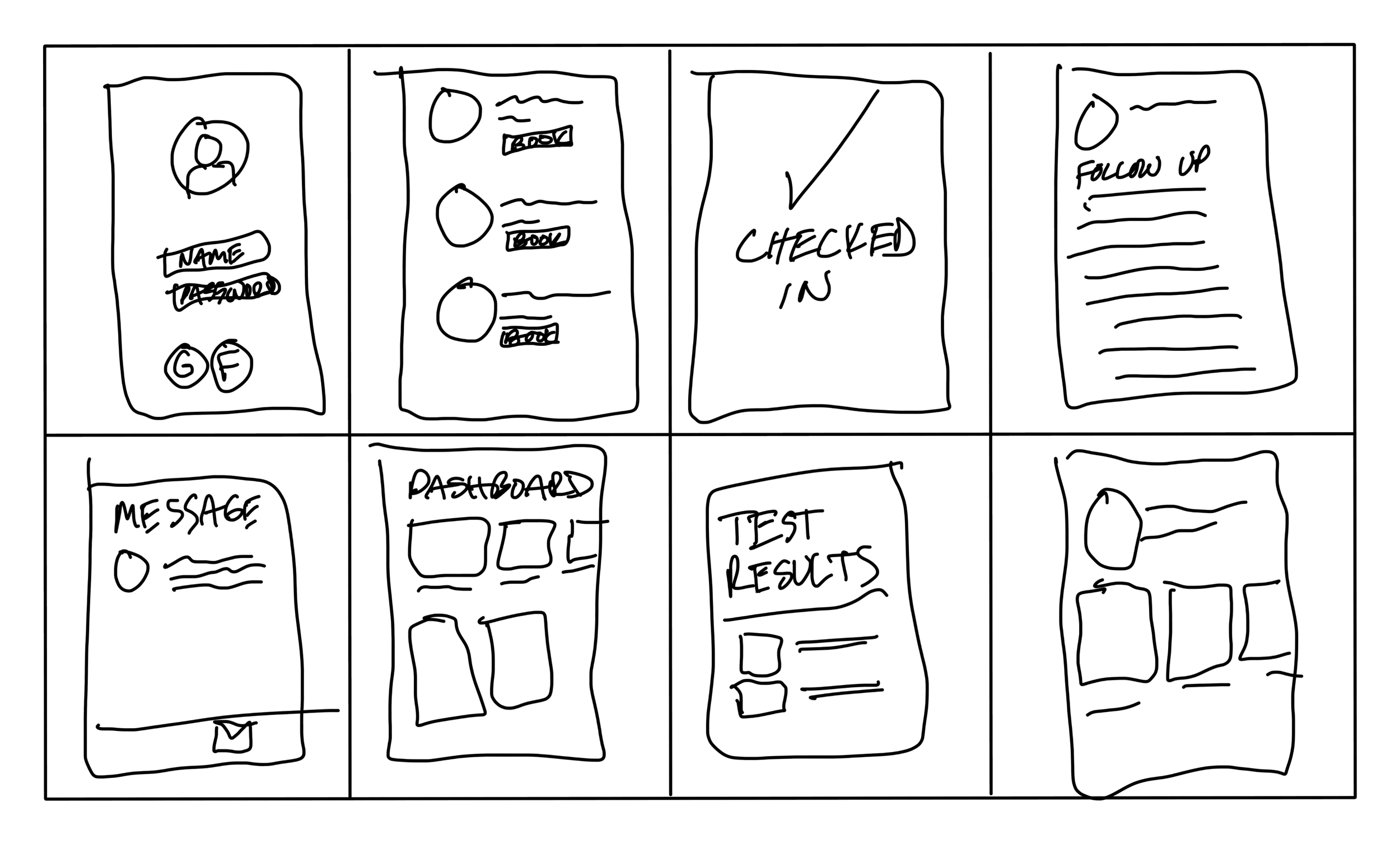
Before I started paper wireframing, I did a Crazy 8’s activity that allowed me to get some rough sketches out on paper for some ideas I had.
Sketching out paper wireframes for all the major screens of the Lifeline app helped guide the direction of the design.
Prototype
Digital Wireframes • Low-Fidelity Prototype • Usability Study
Digital Wireframes
Using my initial research as a guide, I created digital wireframes in Figma. The main problem users were experiencing was finding medical care, so I made sure the design of the app solved that first and foremost.
The app uses the user’s location to show medical clinics near them, and search is front & center, allowing users to immediately find the care they need.
Doctor availability is shown for each date, allowing users to pick appointments that fit their schedules and needs.
Users can easily see which doctors are available at which clinic, as well as available appointment times.
Usability Study Findings
I conducted a Moderated Usability Study of the Low-Fidelity Prototype with 5 participants in Seattle, Washington which lasted roughly 15 minutes. I measured Conversion Rates, and had participants fill out a System Usability Scale.
Confusing Language
3 out of 5 users felt that “Doctors on Call” language on the home screen felt the language was confusing
Profile Picture
4 out of 5 users felt that the profile picture on the home screen was distracting and competed with more important elements.
Today Indicator
5 out of 5 users pointed out that the label “Today” didn’t make much sense and should be “selected day.”
Test
Mockups • High-Fidelity Prototypes • Accessibility
Mockups: Implementing Feedback
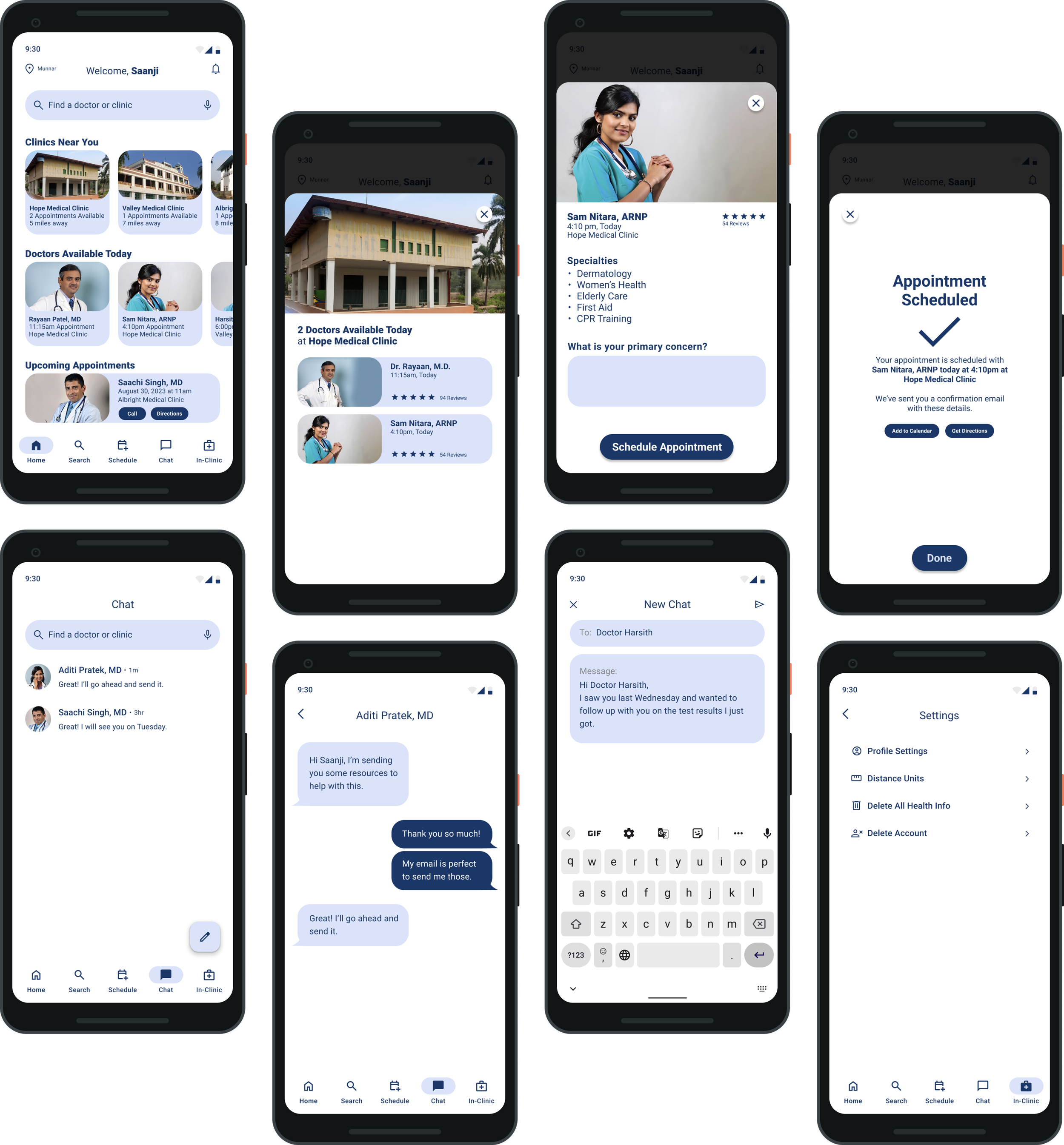
With the feedback I received from the Usability Study of the Low-Fidelity Prototype, I created mockups. I replaced placeholder text with real text, and changed all placeholder images and icons to real ones.
5 out of 5 users felt noticed that the label “Today” didn’t make sense and should actually be “Selected Day” because it the fill changes on which date is selected. This was changed to reflect that change in the mockup.
4 out of 5 users felt that having the profile picture at the top of the screen was distracting and competed with more important elements. I took this out, allowing Search to become front and center.
High-Fidelity Prototypes
Accessibility Considerations
Screen Reader
The mobile app is compatible with screen reader technology, making it accessible to people with vision impairments.
Voice to Text
Areas of text fields and text input can use the user device’s microphone so they can transcribe their voice to text.
High Contrast
The dark blue color used for text & buttons was specially chosen because it highly contrasted itself against the white background.
Responsive Design
Sitemap • Responsive Design Mockups
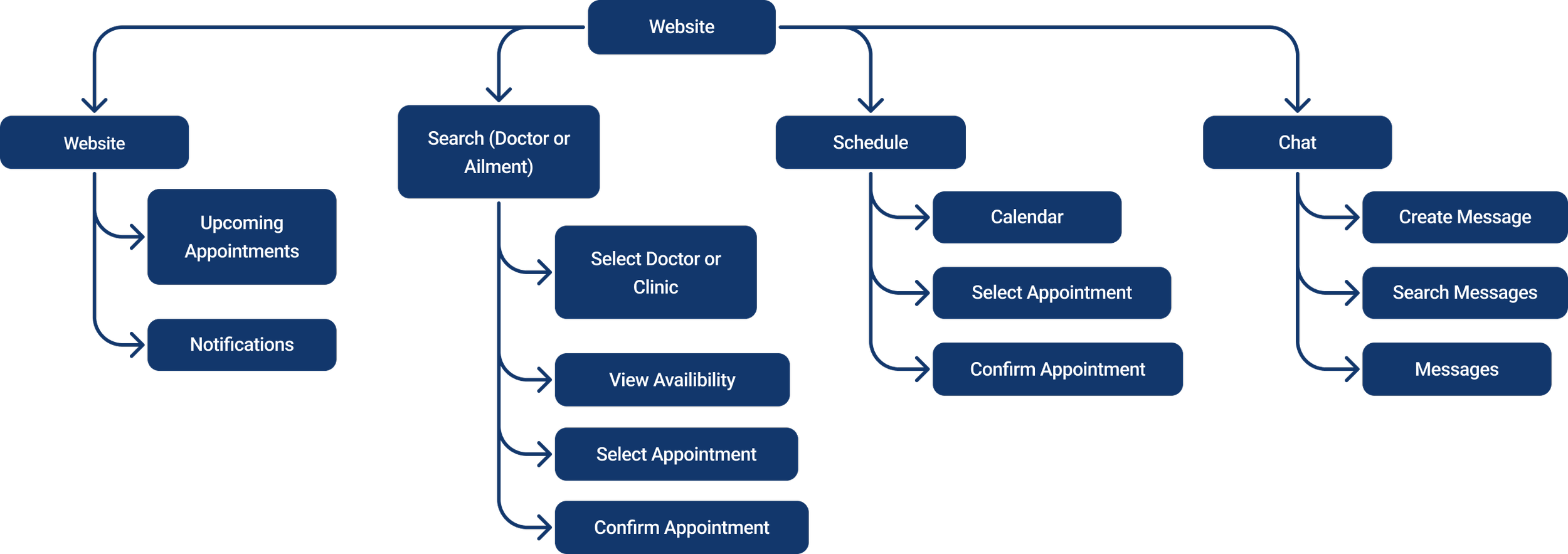
Sitemap
The goal with the sitemap for the responsive website was to make the experience similar to the app while not making it a direct copy.
It needed to make sense as a website, and not a “second” app.
Responsive Design Mockups
Going Forward
Takeaways • Next Steps • Thank You
Takeaways
Impact
Users shared that they loved having an app and a responsive website that made it incredibly easy to find free medical care near them that fit their needs.
One quote from peer feedback was that “the Lifeline app makes the search for life-saving medical care very fast and easy with no distractions or unneeded bells and whistles.”
What I Learned
I learned that there are a lot of medical apps out there, but not many focus on finding free life-saving care for people who need it. I learned that it’s important not to get distracted by fancy features and instead always bring it back to what the user actually needs.
Next Steps
More Usability Testing
Complete another round of user testing to ensure the app & responsive website continue to meet user’s needs.
Expanded Availability
Add more places that can support Lifeline so that more people can get the life-saving medical care they need.
Thank You
Thank you so much for taking the time to review this case study! I had a ton of fun during the different phases of this project. I also want to thank the users who participated in the research and usability studies. You truly helped make this project great!


